
ATL Run Part 2: Designing for Echo Show
Last week, I launched the Atlanta Running Guide on www.atlrunguide.com and corresponding Alexa Skill. This endeavor was a month long project consisting of creating & conducting a survey, data analytics, and designing & coding for different experiences. Check out my previous post on this project: survey insights and journey here.

In this article, I’ll discuss organizing and presenting content for different mediums, devices, and experiences; specifically insights into developing for the website vs. Alexa vs. the new Echo Show. Disclaimer: I am not a User Experience expert, and this is not intended to be a lesson on UI/UX best practices. This is an article intended to get product managers, marketers, content creators, etc. thinking about the need to tailor content for various mediums.
Data Analytics
Let’s rewind to the point when I closed the survey (stopped taking responses). When I completed the survey, I had over 250 survey responses after removing all duplicates and non-runner responses. I started analyzing the data with pivot tables, (considered Tableau), and compiled lists of top five responses in each category. At that point, I had nine categories:
- Top Places
- Top Races
- Top Half Marathons
- Most Unique Races
- Top Races by Season (Spring, Summer, Fall, Winter)
- Best Race Series
- Free Running Groups
- Paid Run Clubs
- Top Training Programs
Each category contained the top five responses. This amounted to 60 data points since each season was a separate category. 12 categories X top 5 responses = 60 data points.
Designing for Alexa
Confession: The engineer in me wanted to code Alexa to provide answers for all 12 categories and 60 data points! #BadIdeas
Since Alexa is a voice experience device, how would I let the user know all of their options? I would need to list all of the options at the beginning when the user launched the Skill.
For example:
User: “Alexa, launch Atlanta Running Guide.”
Alexa: “Welcome to the Atlanta Running Guide. You can ask me for top places, races, half marathons, most unique races, top races by season, spring, summer, winter, fall, best race series, free running groups, paid running clubs, or top training programs. Which category would you like?”
According to the stopwatch app on my phone, it would take Alexa 20 seconds to say the above introductory statement. I would have lost all interest from the user at that point, not to mention that the average user probably wouldn’t be able to remember all 9 options.
I needed to reduce the number of options and simplify the voice experience.
How many options could I offer to the user that they could realistically remember?
 I recalled the “old telephone number rule.” Prior to 10-digit dialing and saving phone numbers in our mobile phones, we memorized 7-digit phone numbers. A scientific study in the 1950’s deemed that telephone numbers should be 7-digits because that’s what people could remember, and even more specifically, people could remember 3 to 4 digits as a time, which is why we added a dash between the first 3-digits and the last 4-digits.
Have you ever thought about why most PIN numbers are 4-digits? According to this article, 4-digits was the most number of digits that the inventor’s wife (Caroline) was willing to remember.
I narrowed the scope of my Alexa Skill down to 4 categories.
User “Launch Atlanta Running Guide.”
Alexa “Welcome to the Atlanta Running Guide. I can provide you with top places, races, run groups or training programs. Which category would you like?”

Website Design
I started putting together the website by creating a blog post for each category. Then, I grouped the blog posts into 3 main categories. The tag line on my website read, “Best places, races, and running tribes in Atlanta.”
Thus, my 3 main categories were
- Places
- Races
- Tribes
I had 9 posts under races, half, series, overall, by season, 3 posts for tribes free running groups, paid run clubs, and training programs, but only one post for ‘Places.’
I decided to dig back through the data again to gleam more insights into places to run in Atlanta. I ranked the next 10-15 running places and started grouping by common areas.
I came up with 5 additional categories for ‘Places.’
- Southside
- ITP – Inside the Perimeter
- OTP North Central (Outside the Perimeter near GA 400)
- OTP North-West (Outside the Perimeter along I-75)
- OTP North-East (Outside the Perimeter along I-85)
Unlike the Alexa Skill, I created more sub-categories for the website. I also added the ability to search and menu bar with the 3 main categories along the top.
Image Selection
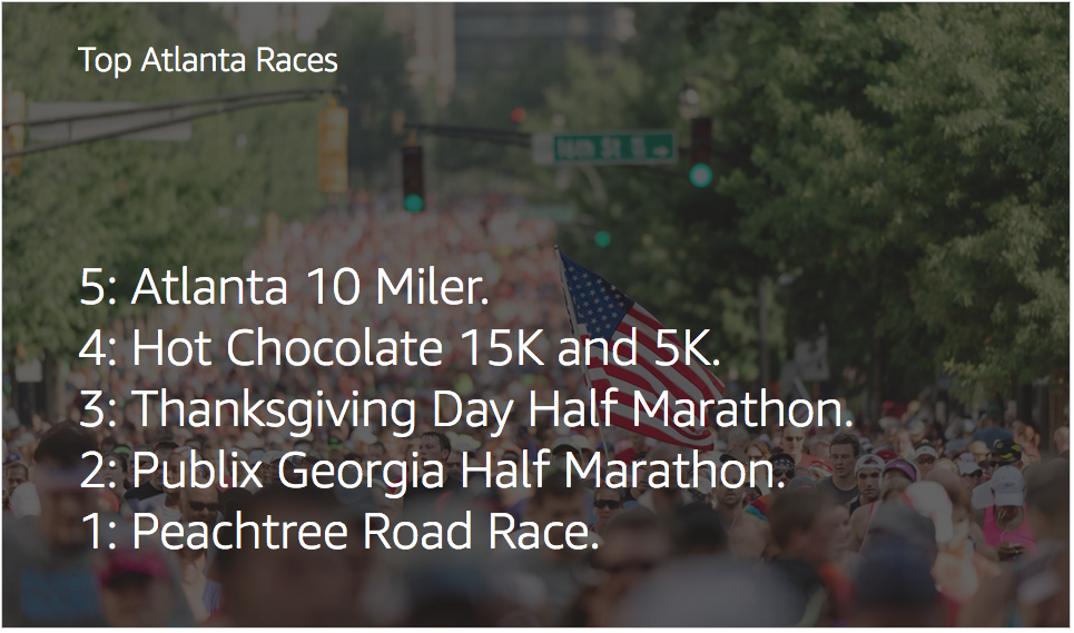
I realized that pictures would be key to designing the experience for the Atlanta Running Guide. I scoured through 5 years worth of photos I had taken at various races around the city. Since the largest races (i.e. Peachtree Road Race) were voted the top races, I looked for races with large numbers of runners. I also looked for photos highlighting the Atlanta skyline or anything iconic to the city. Finding pictures of running groups, clubs, and training programs was far easier as I had many group photos in my collection. I was also incredibly lucky to have an amateur photographer friend who gave me a free pass to use her pictures.
I spent hours selecting “just the right” picture for each category. I aimed to illuminate each category with relevant images and I also considered how and where I would present these images. On the homepage of the website, I wanted to present the user with a matrix of images, one image per category with an eye catching slider at the top. On the Alexa / Amazon Echo, there were no pictures, except for the thumbnail image available on the companion app. I put thought into which picture would be shown for each answer.
Designing for Echo Show
On the Echo Show, I had a few more options, but I had to work within a limited number of templates. At the time I created the Skill, there were only 6 templates available for Echo Show. Due to the amount of text (5 ranked answers in each category), I decided to go with the background image and text overlay. Amazon has put forth a “Design for Voice” guide that provides guidelines for voice experiences and voice experiences with Echo Show.
Amazon has added a whole new dimension to their line of Echo devices with the Echo Show. This device features a 7-inch touch screen. The good news is that developers do NOT create responsive designs since all Echo Shows have the same size screen. Today’s limitation is that there is a limited number of templates (about 6 at the time of the writing of this article).
Differences between the developer simulator and the actual Echo Show:
- If no background image is specified, the simulator will load a white background with black text, while the device will present a dark background with white text.
- The simulator does not support touch screen simulation. This means that if you are developing a quiz or something with choices that the user can select by touch, you cannot test this functionality on the simulator.
- Tester must press the “Listen” Play button on the simulator to hear the Alexa response vs. automatic Alexa response with the Echo Show. This creates an inconsistent experience between the simulator and the live skill.
- In order to move the test skill along in the simulator, the user must type their response into the simulator vs. speaking to Alexa.

Lessons Learned
After all of this, I would not create an Alexa Skill for Echo, and especially Echo Show without first testing on a real device. Testing and re-testing before submitting to Amazon for Certification and subsequently general availability is ESSENTIAL. The Amazon Certification team checks for adherence to guidelines, and not for presentation of your content. If you are working with a developer, ensure that you have set clear requirements to the voice interactions, screens for Echo Show, and “cards” for Echo, Echo Dot, and Echo Tap on the Alexa Companion App. If your developer does not have their own device, you will either need to perform all QA testing yourself, or hire a tester with the devices to test against your specific requirements.
Epilogue
At the end of the day, product management and marketing is a combination of art and science. The “science” consists of facts, analytics, coding, which leads to the “art” – presentation of the content in a rich and meaningful experience for the user.
Both ART and SCIENCE are equally important for success.
I submitted Atlanta Running Guide to Amazon and received approval within a few days. This was my 6th approved Alexa Skill. Here’s a list of all of my approved Alexa Skills on Amazon.
I launched the website on August 11, 2017. Check it out! www.atlrunguide.com
This project combined social information gathering, data analytics, coding, and designing for voice and visual (and combinations thereof) mediums.
Here’s the video demo of Atlanta Running Guide